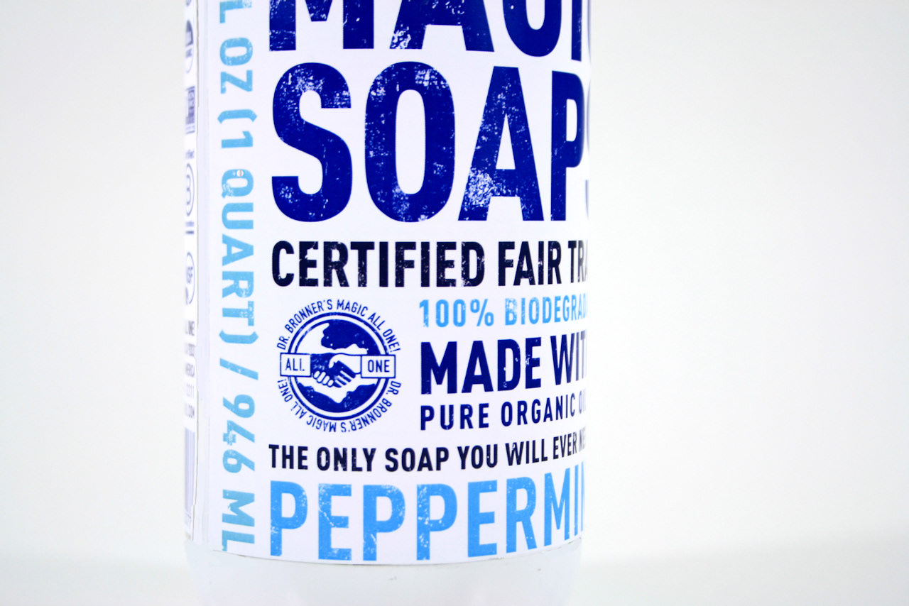
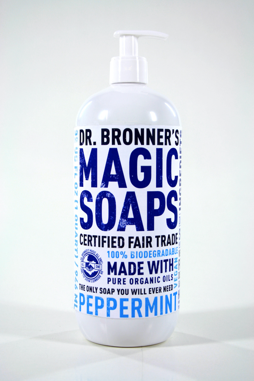
Re-designing Dr. Bronner’s iconic, text heavy label as a student project was a fabulous typographic challenge.
I was inspired by classic American Wood Type to reflect the product's boldness, enthusiasm, and larger than life message.
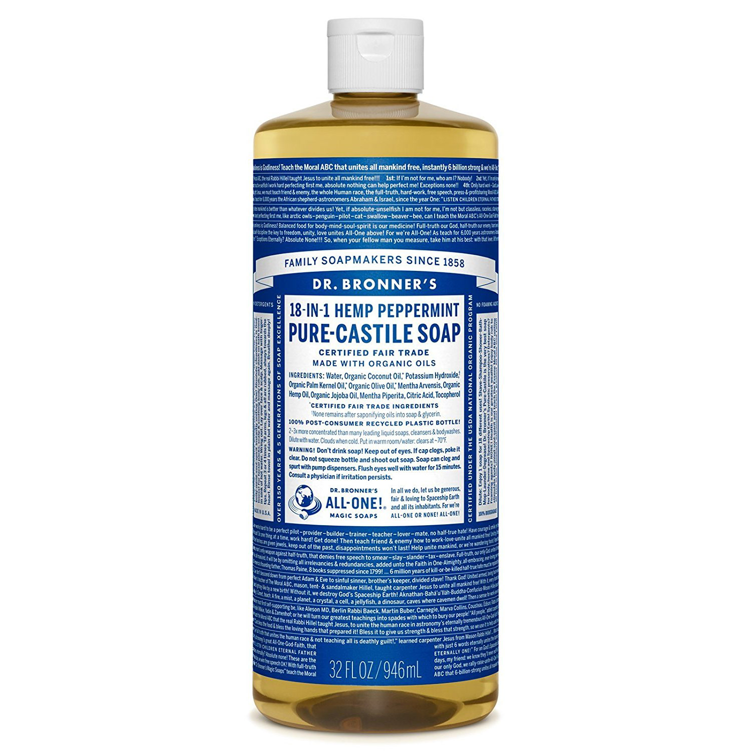
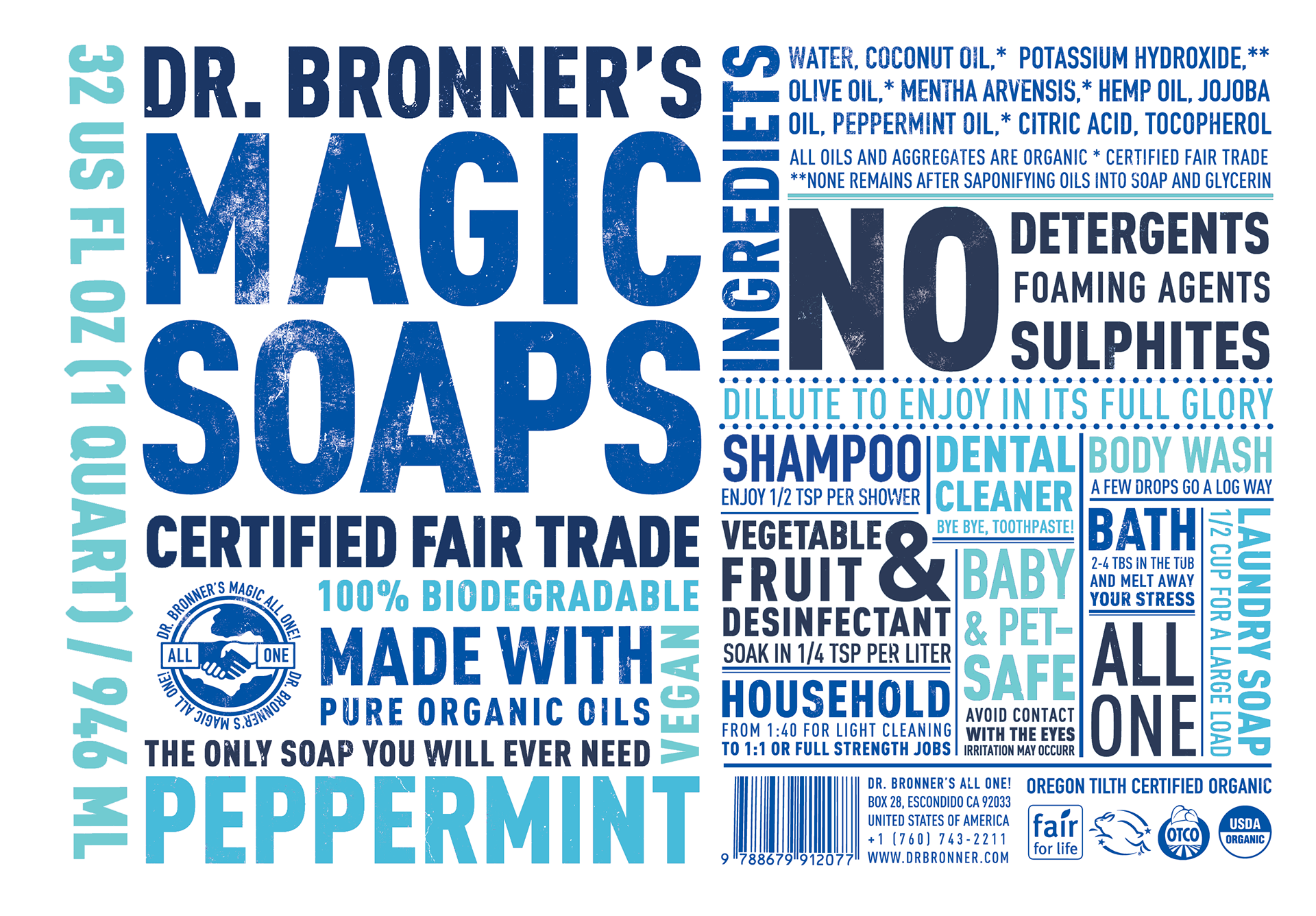
Original Design